


By Ferry Vermeulen and Vadim Rybakov
You have spent months, or even years, on the development of your super user-friendly product, but the user manual still sucks.
You don’t want your user to have a bad customer experience due to struggling with your manual. Ideally, you would like to have an easy to understand, comprehensible and well-illustrated manual…. Or even better. But just how do manual designers produce comprehensible manuals? Do you ever wonder what their secret is when creating a user friendly manual?
In this post, we will reveal the untapped secrets of the best manual designers for creating awesome instructions and will give you clear instructions on how you can do exactly the same using SOLIDWORKS Composer.
1. Do not illustrate your manual
There is one major thing that should be mentioned that really distinguishes good manuals from the rest, and it takes the number one position in this post: good manuals are incredibly continuous.
This cannot be achieved by illustrating the drawings based on photos or free drawing techniques. Awesome illustrations are mostly created with the original 3D technical drawings.
In order to create comprehensible drawings, make sure you have 3D models of your product available. If you don’t have them, maybe because you simply imported the product, you can easily have them created using freelancers on platforms like Upwork.
To help create a 3D model, make sure you send your freelancer very clear photos of all the details and moving parts that are needed to explain the use of your product in the user manual.
When your 3D model is ready, use SOLIDWORKS Composer to create comprehensive illustrations for technical communication.
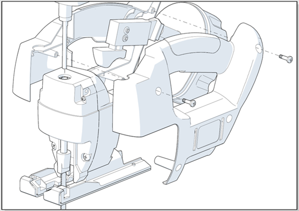
Clear manuals usually always have the same perspective and view. With SOLIDWORKS Composer, you can set the desired perspective and view and use it for every illustration, over and over again.
Designers take pains to render each successive picture from a single, unchanging point-of-view (mimicking that of the customer), so that confusing rotations or perspective changes are minimized. The customer can stay oriented more easily as he or she moves back and forth between the booklet and the parts.
To create illustrations with the same perspective and view using SOLIDWORKS Composer:
- Select File>Open.
The Open dialog appears. - Select the file you want to open and click Open.
- Click on the arrow of the Align Camera icon in the Home Select one of the ¾ views from the list. Usually, these four views will be sufficient to create all you illustrations. By choosing one of them, you will always get the same view of your product.


- Select File>Preferences.
The Application Preferences dialog appears. - Select Camera. Set the Default perspective to 20 degrees.
- Click OK.

Explanation:


Figure 2 shows the same view but with different perspective angles. The larger the angle, the bigger the distortions will be. By using a ¾ views and by setting the perspective angle, you will always get the same view and perspective for all of your products.
2. Make use of distinctive colors
Although most manuals have a black and white appearance, smart manual designers work closely with product designers to use color-coding in their products.
When colors play an important role for being able to install the product correctly, smart product designers make sure a colored image is not necessary by coding the color in their products.
For example, with products that require electrical installation, it’s pretty important that you know exactly how to connect electrical wires. Where the wires of many products are a uniform brown, blue or black, as a manufacturer you could add an extra coding, like a black line or a spiral-shaped design. By doing this, the colored wires can easily be distinguished, even in a black and white user manual.
To create illustrations with color coding:
- Click on the Technical Illustration icon in the Home The Technical Illustration pane appears.
- Uncheck the Color Regions checkbox from the Workshops pane.

-
- Click Save As… to save the file as a SVG file on your computer.

- Click Save As… to save the file as a SVG file on your computer.

- Open the saved filed in Adobe Illustrator. Add the color coding.
3. Add text to the user manual
An image does not need to be translated and an image says more than 1000 words. Those are the main reasons why many brands limit the text in their user manuals. However, not using text isn’t always possible. Often times, text isn’t always necessary when only the installation of a product needs to be described (and not the use of a product). For some products however, describing the use is a must.
Text can also increase the safety level when there are installation steps that contain a higher level of risk, for example during electrical installation. Also, any other warnings against residual risks during the complete product life cycle can be added in text.
Where installation steps can only be explained fully with illustrations, explaining the use of a more complex product may still need some textual support.
To add text to illustrations using SOLIDWORKS Composer:
- Click on the Text 2D icon in the Author
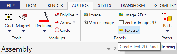
- Click in the middle pane on the location where you want to add text. Type your text.

- Edit the font, background color, shadow, etc. from the Properties

- You can add another text field or you can move the product image or text.

4. Avoid a comic-book kind of approach
Although many well illustrated manuals very much look like a comic book, telling a story with a user manual should be completely avoided; think in topics when creating your user manual! Topic based communication in technical manuals uses a modular approach for content creation. With this approach, all content is structured around topics.
A topic always has a well-defined beginning and ending. At the end of a topic, a particular task has been completed. This has huge advantages. By structuring around topics, (parts of) topics can be mixed and reused in different contexts. The opposite of topic-based authoring is narrative content, written in the same type of linear structure as written books. One example of a topic-based approach would be the way the following task is described:
- Use a screw driver to attach all 14 screws (article number 118331).
By using a topic based approached, illustrations can be reused throughout the manual, or even throughout manuals about other products, especially if you use the same views all the time.
5. Use the right tools
With the right 3D software you can create comprehensive illustrations. With these tools you can set your perspective and views to create consistent illustrations and ensure consistency for all future publications.
I think SOLIDWORKS Composer is by far the best tool to use to achieve the desired level of branding in your company’s instructions. But, whatever software you use, make sure to export your drawings as vector images.
6. Begin with a promise
Consider beginning you manual with a promise: the end result. This has a HUGE psychological effect. When buying a product or DIY product, you often dedicate your evening or Saturday afternoon to build your recent purchase. By directly visualizing the end result at the beginning, the user is confident that he will complete his task successfully.
To start with a promise:
- In SOLIDWORKS Composer, make sure you have chosen the same view and perspective as the rest of the drawings (see step 1).
- Create an illustration of the fully assembled product.
- Add this illustration as the first picture in the user manual
7. Use corporate guidelines
Consistent illustrations determine for a large part the look and feel of your manual. However, in order to create ultimate consistent manuals, you should use corporate guidelines for your instructions.
These guidelines include elements for the brand design, logo and a specific font and colors. When using text, also consider to use guidelines for the language (American English or British English?), the tone of voice, the system of measurement, how do different types of information look like (e.g. warnings, instructions, tips) or when to use various types of highlighting (e.g., bold or italics type).
To choose specific (line) colors in SOLIDWORKS Composer:
- Click on the Technical Illustration icon in the Home The Technical Illustration pane appears.
- Click on the arrow from the Show visible lines dropdown menu.

- Select More Colors…
- Choose the required color.

- Select the Preview button to see how your illustration will look like.
To use your company’s font:
-
- Click on the Text 2D icon in the Author

- Click on the Text 2D icon in the Author
-
- Click in the middle pane on the location where you want to add text. Type your text.
- Make sure your text is selected.


- Select the font you need.


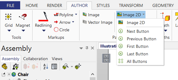
To add your company logo:
- Click on the Image 2D icon in the Author Select Image 2D.
-
- Click in the middle pane and create a logo place holder by dragging your computer mouse.

- Click in the middle pane and create a logo place holder by dragging your computer mouse.

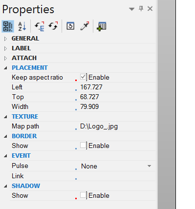
- Make sure the logo field is selected. In the Texture field of the Properties pane, click on the button with the three dots behind Map Path. Browse to your logo, select it and click OK. Your logo is placed. Notice: added 2D images will not appear in the technical illustration preview. To see your logo, save the file as as SVG or EPS file.

- In the Placement field of the Properties Pane, make sure that Keep Aspect Ratio is checked to avoid distortions of your image.
- In the Border field of the Properties Pane, make sure that the checkbox is unchecked.
- In the Shadow field of the Properties Pane, make sure that the checkbox is unchecked.
Conclusion
Your user deserves a great user experience at every stage of their customer journey and after spending all that time creating a great product, you also want to give your customer a good experience when consulting the user instructions.
Imagine a user being able to install or use your product without any help from customer support.
Imagine a user manual that contributes to a better user experience.
You can achieve this!
In order to do so, follow the steps as described in this post and your users will as excited when installing or using your product with your stunning user manual as you want them to be!
 Vadim Rybakov
Freelance Technical Illustrator
I have over six years of experience with Solidworks Composer. What started as a hobby evolved to helping dozens of companies in creating professional technical illustrations. Take a look at my works on Behance and Linkedin.

Ferry Vermeulen
Categories: Design, SOLIDWORKS Composer, Tips & Tricks, Usability